Brand Identity
Nine Arrows
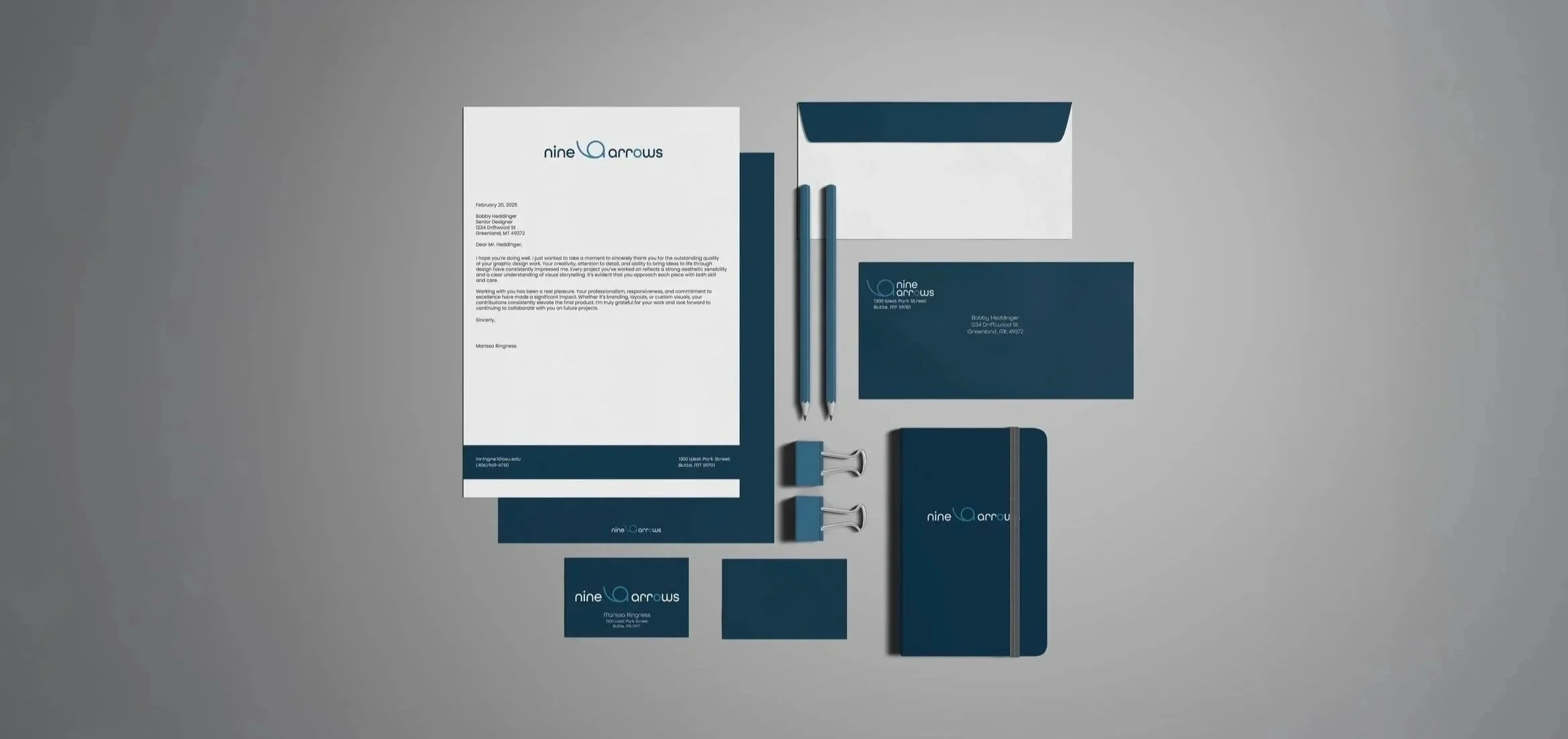
The Nine Arrows project was created to showcase the use of different business signatures. Nine Arrows is an elegant restaurant where customers would go to enjoy a relaxing tasty dinner. I used the dark teal blue to present a calm and trustworthy environment as well as the smooth lower-case typeface to indicate the classy flow of the restaurant.
MOAVC Cosmetics
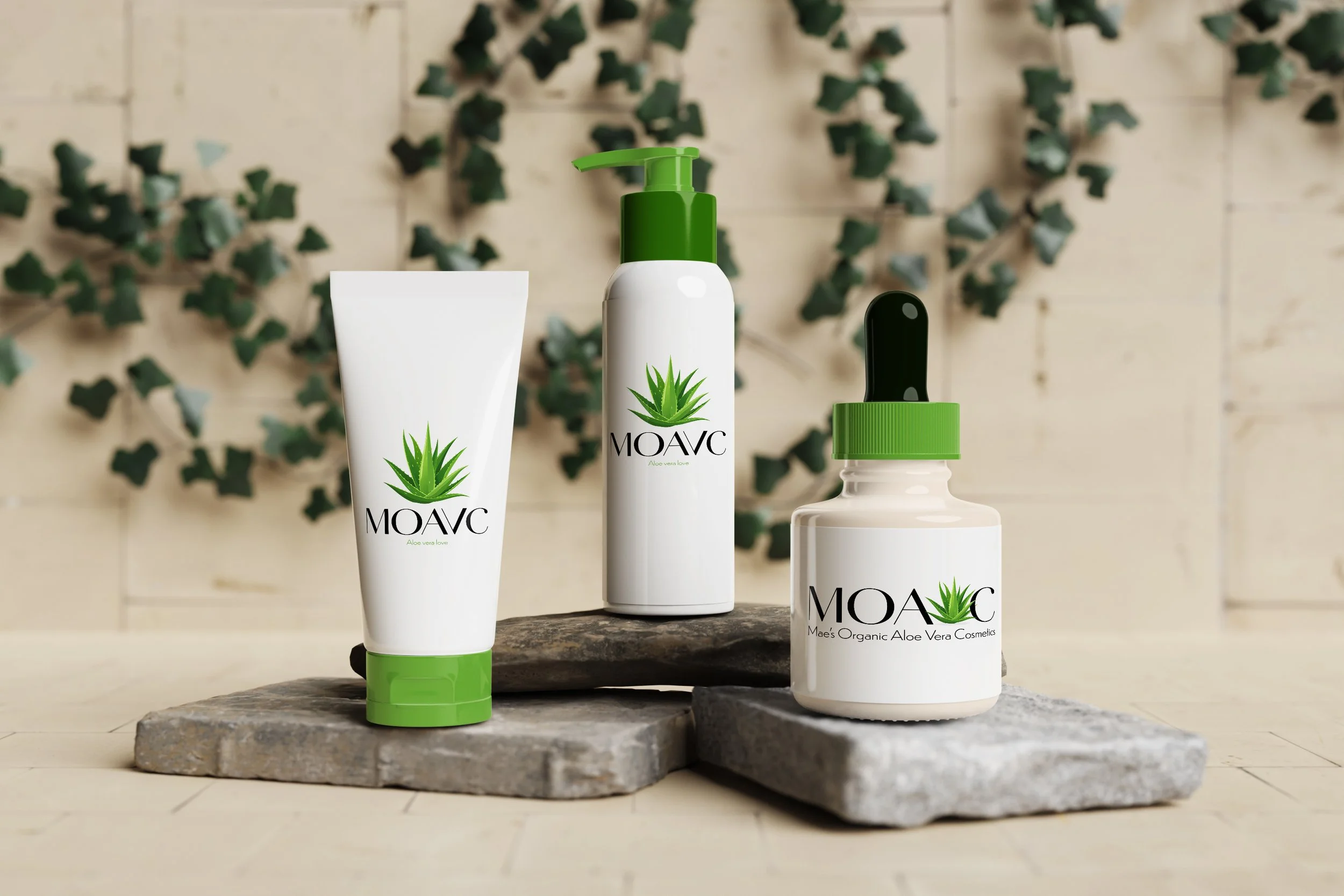
MOAVC is an aloe vera cosmetic brand that is designed for sensitive skin. The goal for this brand is to help the customers feel naturally beautiful by using plant based products. For this brand I wanted to showcase an elegant and natural brand image. I kept the color pallet simple (white, green, and black) to present an organic and trustworthy look.
Splatoon X Poppi Soda
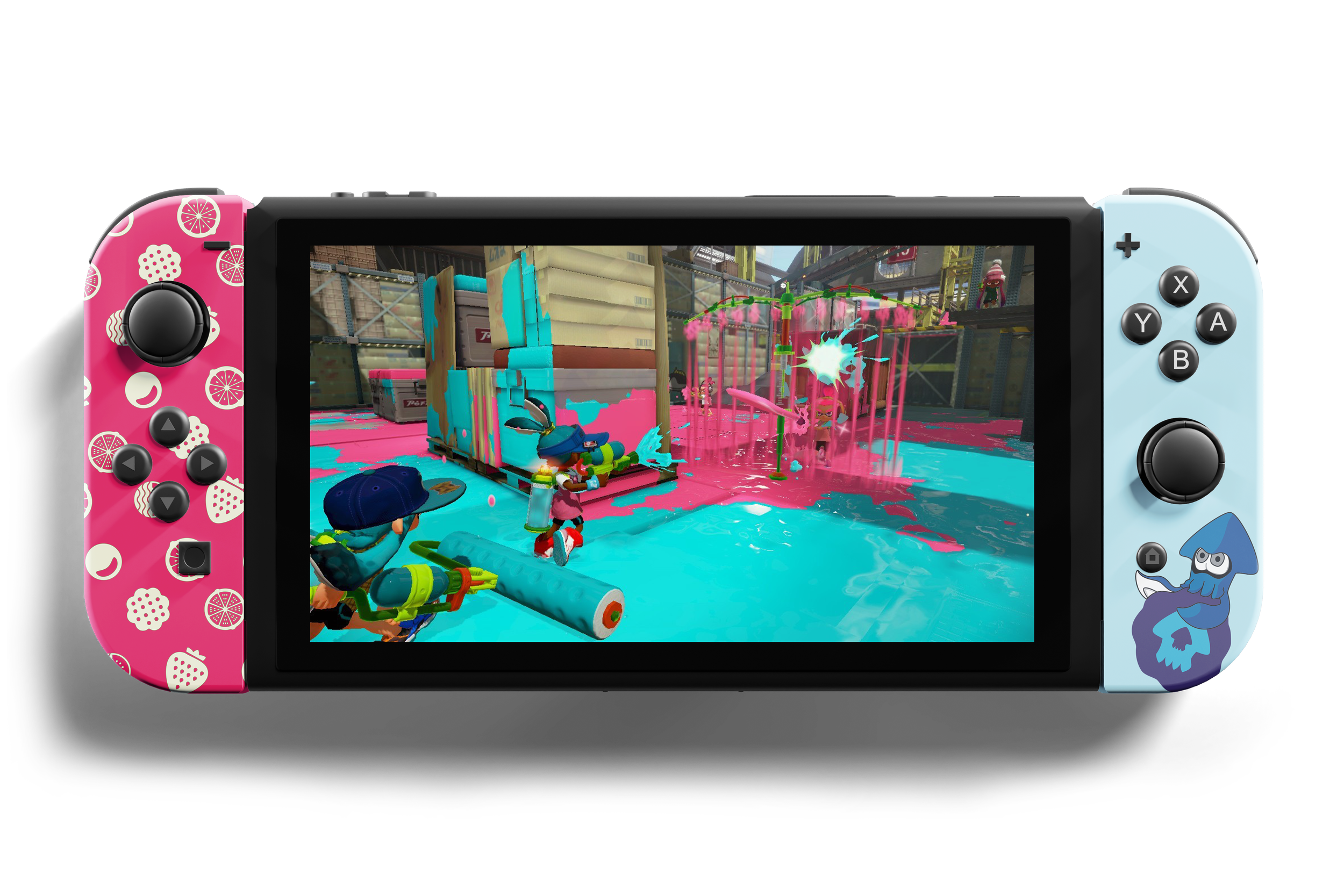
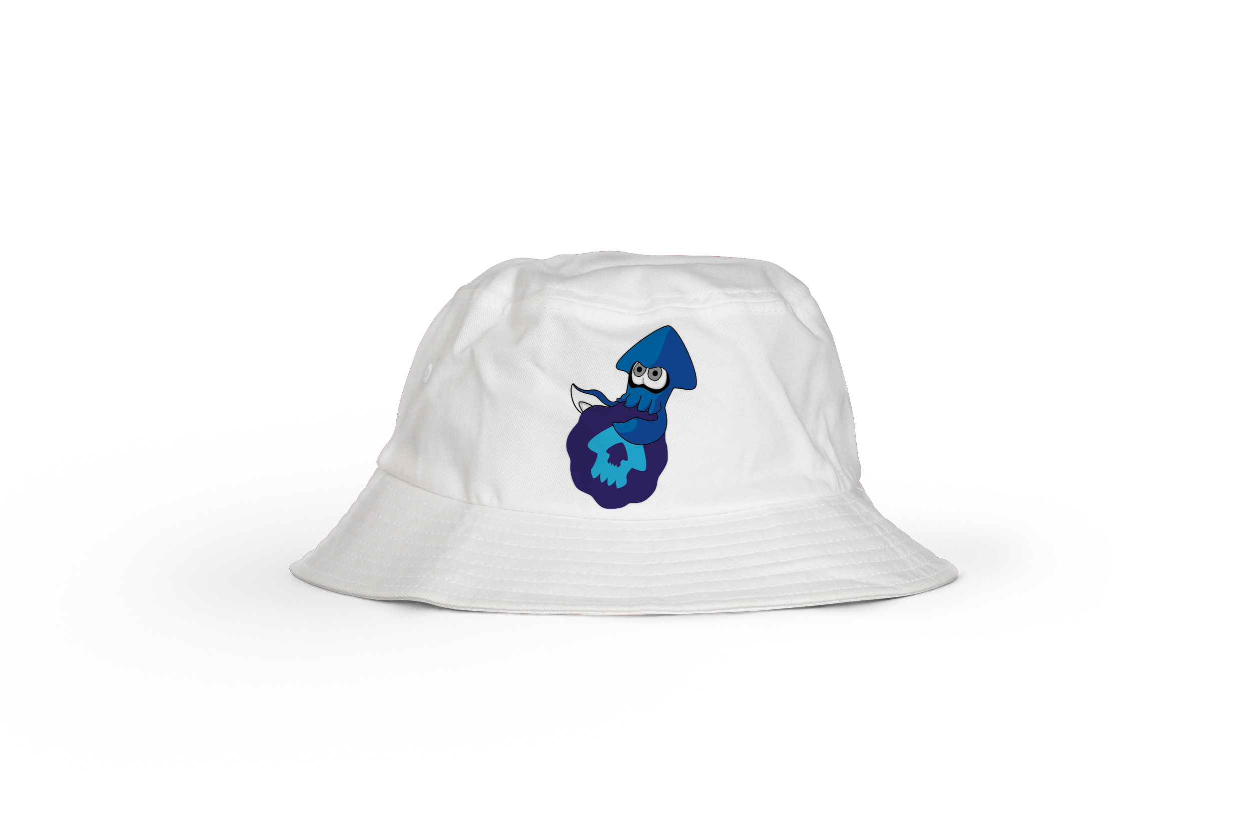
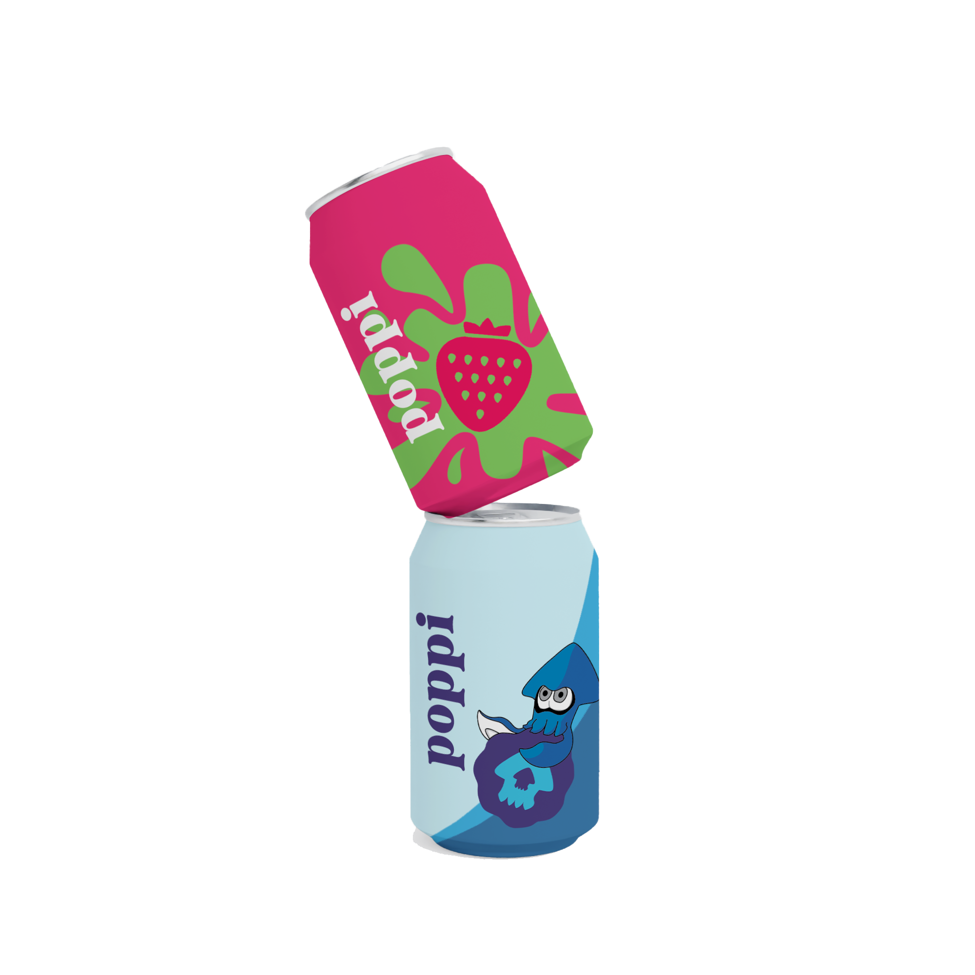
This project showcases the collaboration of two brands Poppi and Splatoon. I wanted to use signature imagery of each brand that viewers would recognize. E-sports has found their new favorite healthier drink. I used the vibrant contrasting colors of Splatoon to draw the attention of the audience and create custom icons of Poppi’s fruits with Splatoon’s squids.
AirPod Pros Promotional Cube
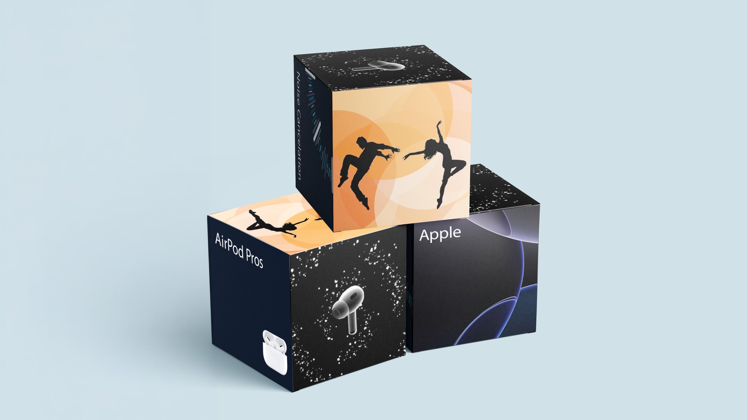
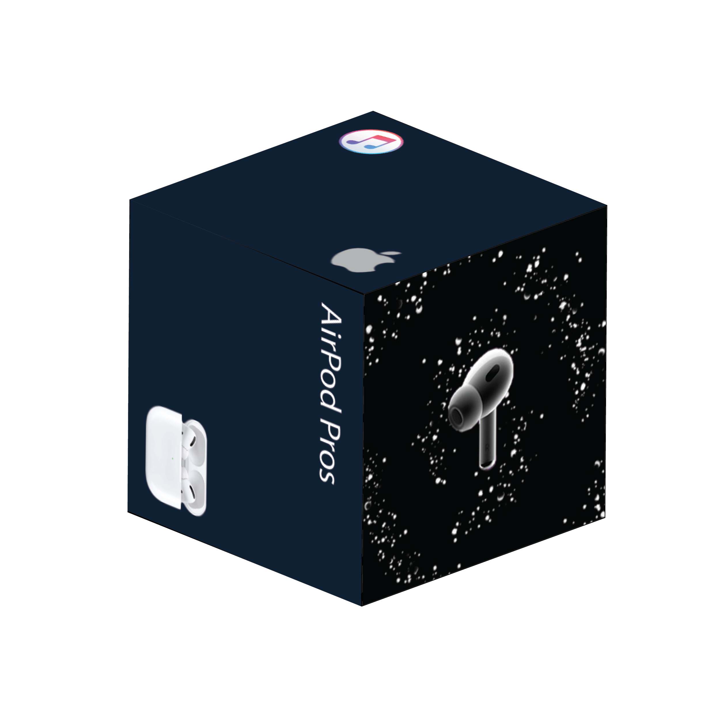
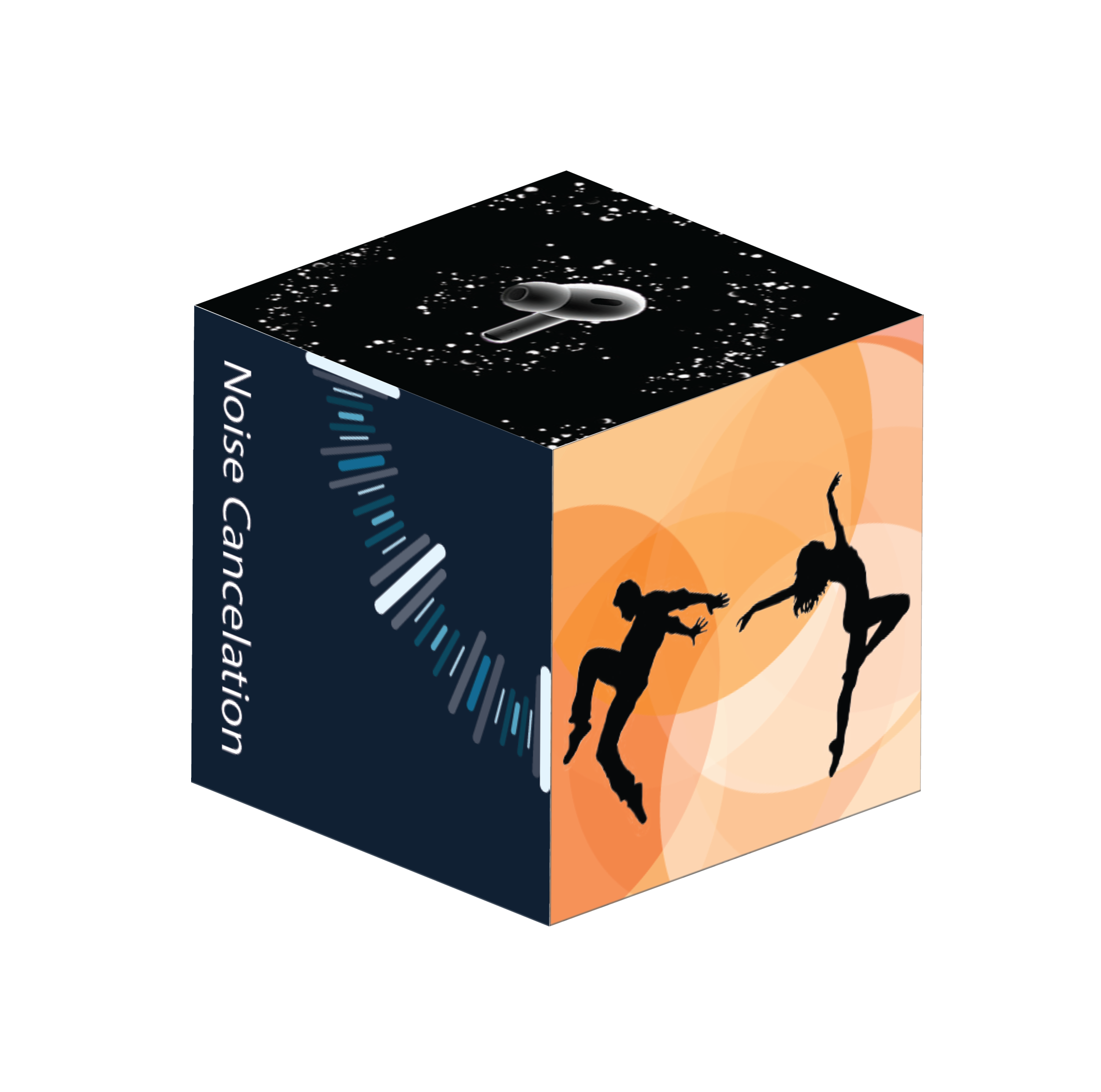
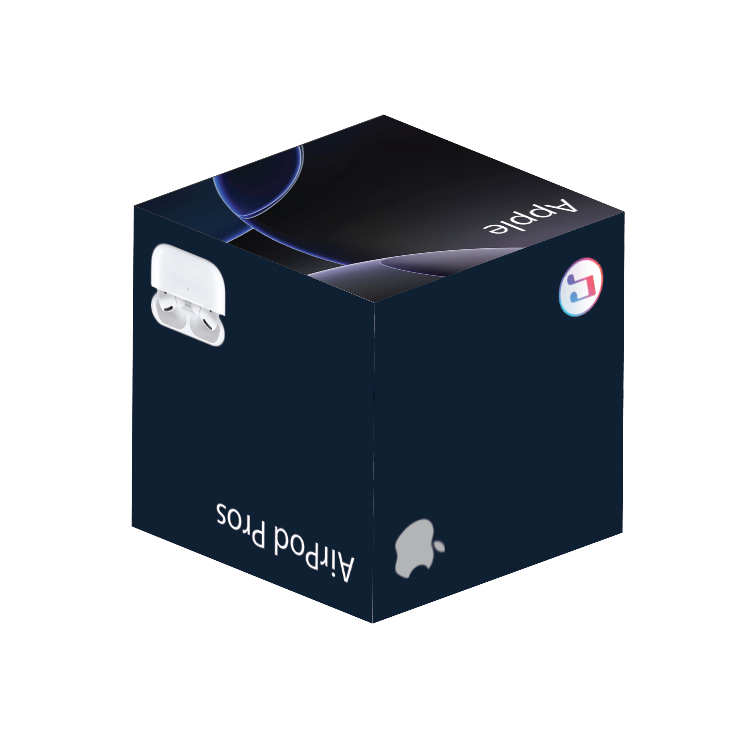
For this project, the goal was to create a promotional cube that represents and markets a product (AirPod Pros). Every design moves the viewers eyes to the next side of the cube. AirPods are primarily used to listen to music, therefore I wanted to make sure I added elements that visually showed rhythm and movement. I used the concept of dance and sound to show this. Each face of the cube showcases a special feature of the product or represents the Apple brand.
Illustration
US Stamps
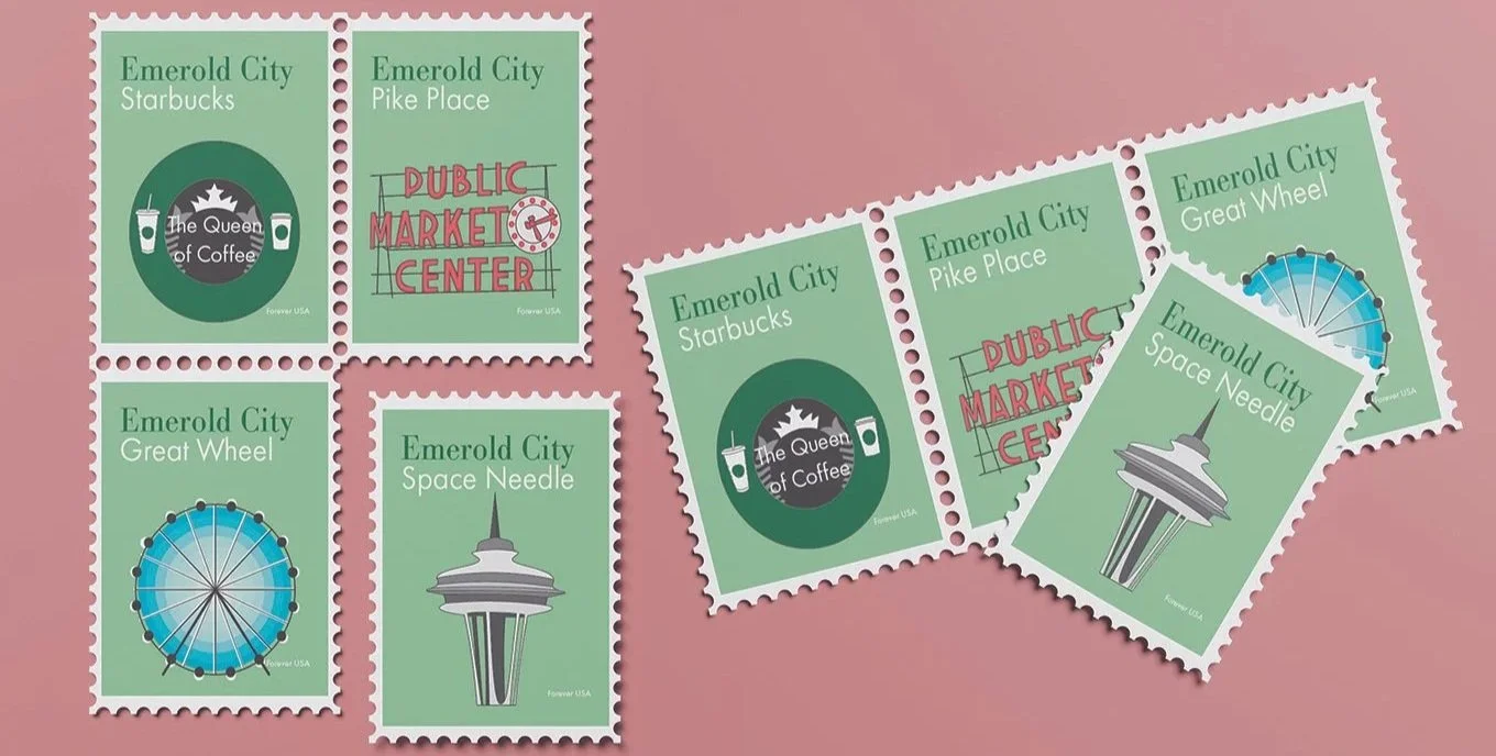
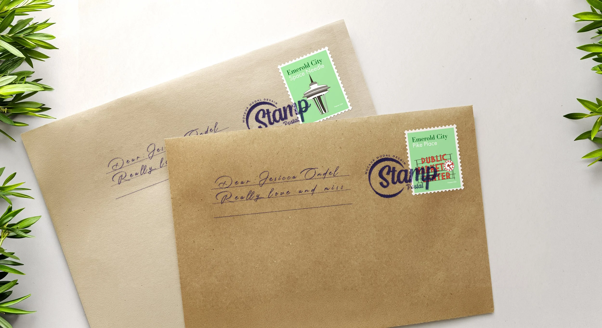
For this project, the goal was to create four corresponding US stamps. The theme of the stamps is Seattle, Wa. I wanted to capture the elements of Seattle’s most well known landmarks within each illustration. For each stamp, I wanted the design too look realistic drawing. This took a lot of attention to detail and precision to make each design my own. I had to make sure all colors and designs worked well together but also be recognizable on their own.
Knots
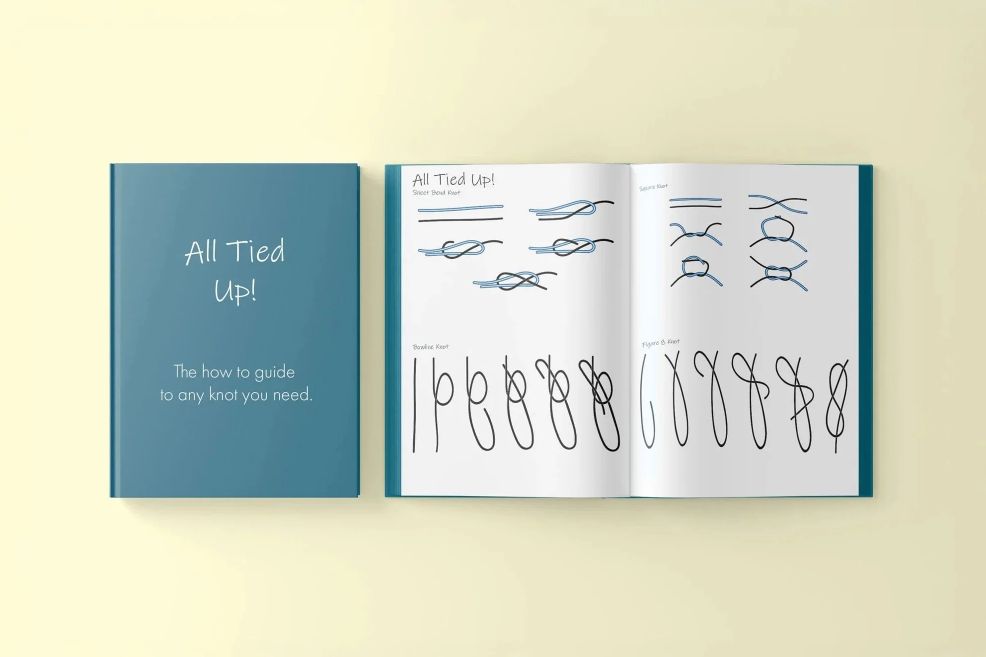
The knot project was designed to demonstrate consistency and attention to detail within my work. Each step had to be a continuation of the previous, showing exactly how each knot is made.
Photography